
Arkotype -- Projects / Prints / Work.
-
 Is itOutRun?
 -
Yeah well I probably deserved that
-
I'm tempted to pay you to make me an Arkotyke. They really are nice.
-
Cheers all! I've put together a bit of a brand guideline doc for those interested --
https://www.behance.net/gallery/50493487/Arkotype-V2-Brand-Guidelines -
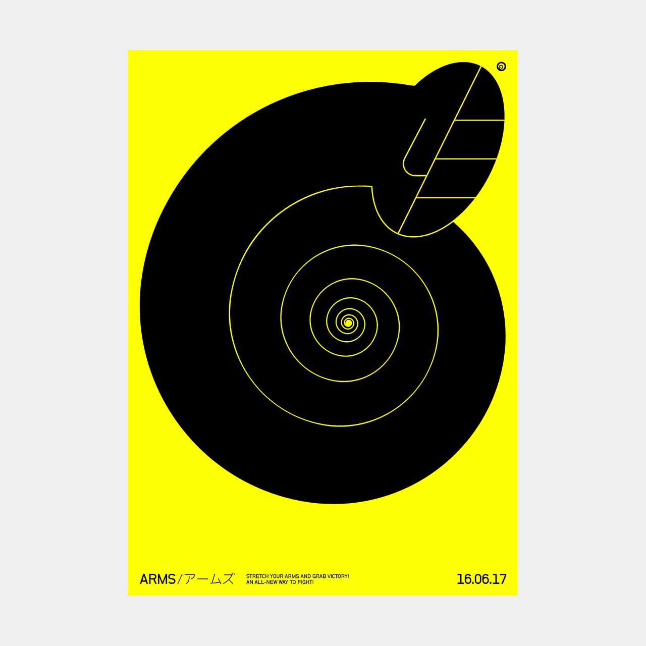
Had this idea for a little while and finally got around to putting it together this week - Considering a small print run --
-
NiceiosGameCentre:T3hDaddy;
XBL: MistaTeaTime -
 Love your imagination"I spent years thinking Yorke was legit Downs-ish disabled and could only achieve lucidity through song" - Mr B
 -
Dang I wish I hadn't looked at your site. It reminded me that I don't have that Fez print.
-
 Very nice dan.
Would love something Wipeout (Feisar) related...hint...hint. -
 Mr Driller is a rich seam. I love the design of it.
Mr Driller Drill Land on GC is absolutely gorgeous.
Holding the wrong end of the stick since 2009. -
New project - A brand for a new indie publisher called No More Robots that launches today - Been working on this one for a while, happy with how it's turned out and I'm looking forward to seeing something I've made in a game!


Full case study here. -
 Show networks
- adrianongaming
- Xbox
- EvilRedEye8
- PSN
- EvilRedEye8
- Steam
- EvilRedEye8
Send messageI don't know a thing about design - how come the dimensions are slightly varied around the 'T' in ROBOTS, out of curiosity?"ERE's like Mr. Muscle, he loves the things he hates" -
The T is deliberately shorter because the space between the two surrounding letters is optically too much otherwise - it's only a slight tweak but it does make a lot of difference - especially when scaled down.
-
Show networks
- adrianongaming
- Xbox
- EvilRedEye8
- PSN
- EvilRedEye8
- Steam
- EvilRedEye8
Send messageAh, cool. Thanks for the explanation!"ERE's like Mr. Muscle, he loves the things he hates" -
 That's an excellent logo Dan.I'm falling apart to songs about hips and hearts...
 -
Lovely, lovely work. The details... Mmmm.Mostly an idiot. Live: thedarthjim / Instagram: mrjalco / Twitter: @MrJalco
-
Nice one! I look for to seeing it in a game too.
-
 Elegant simplicity.Come with g if you want to live...
 -
Echo thoughts, lovely work.
Very minimal, which is desceptively difficult. -
Nice. That tee is cool.iosGameCentre:T3hDaddy;
XBL: MistaTeaTime -
Lovely stuff as always, great eye Dan"I spent years thinking Yorke was legit Downs-ish disabled and could only achieve lucidity through song" - Mr B
-
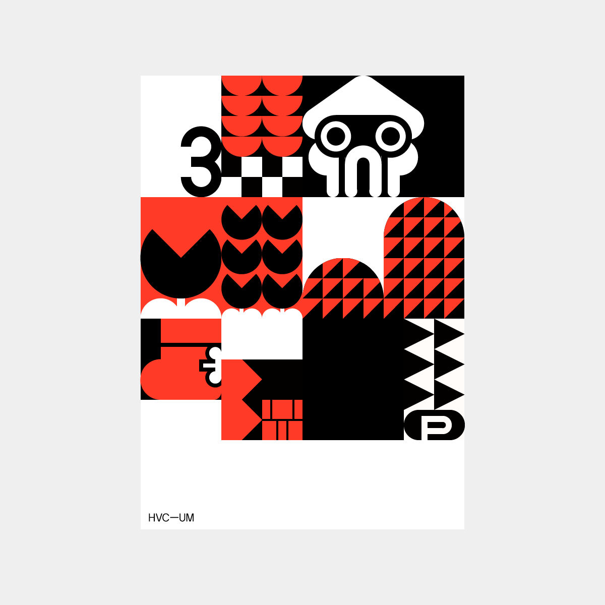
This is something I’ve been working on for a little while - it’s a series which is based on the sprites and textures of Super Mario Bros. 3 - still a work in progress but if I do anything with this one I’d ideally like to expand it beyond a print into a box set / bundle with a print, specimen book, tee and pin badge set.
-
 Looks fab as always, Dan
 -
Nice.
No raccoon tail though....Holding the wrong end of the stick since 2009.


")
Howdy, Stranger!
It looks like you're new here. If you want to get involved, click one of these buttons!
Categories
- All Discussions2,715
- Games1,879
- Off topic836