
Sins of the Silicon and Console Curios
-
That's a terrible list. It feels like it was just chosen at random. Sega mark 3 but no dreamcast? No pc engine? No neo geo? Bah!SFV - reddave360
-
The PC Engine looks like 90s aids.
If you think it looks good you have no taste. -
The Dreamcast was a beige box of boredom as well. Games were good but the console and controller can go in the bin aesthetically.
-
 The Gamecube in black or white trim was a pleasing looking console but I really can't think of too many others.
The Megadrive Mk1 and N64 had nice curves but nothing else springs to mind. One of 64's colour variants would be pleasing to the eye - esp. those semi opaque ones.Holding the wrong end of the stick since 2009. -
 Neo Geo design holds up quite nicely.Steam: Ruffnekk
Windows Live: mr of unlocking
Fightcade2: mrofunlocking -
 orginal NEO GEO was the daddy of all, it's size, it's pure 2001 obsidian slabness, utterly timeless"I spent years thinking Yorke was legit Downs-ish disabled and could only achieve lucidity through song" - Mr B
 -
cockbeard wrote:orginal NEO GEO was the daddy of all, it's size, it's pure 2001 obsidian slabness, utterly timeless
It's a thing of beauty in its original size. With the massive stick. I saw one at an importers (anyone here remember pas consoles back in the day in Dublin?) and it stuck in my memory. Just a sleek design.
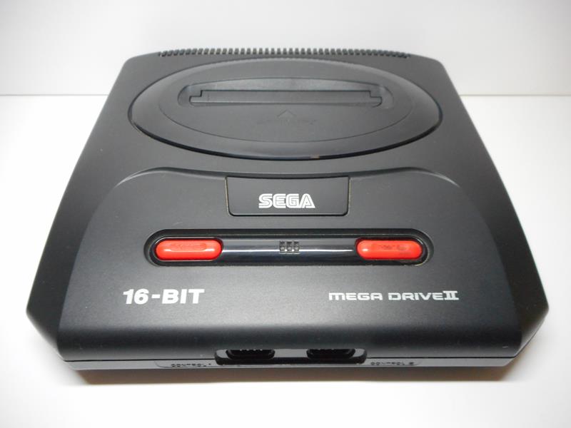
The dreamcast in its normal colour is a touch bland but I loved all the different colour versions. I also love small console designs, so most things in mini format are a win to me (the exception being the mk3 mega drive - cheap and ugly.)
SFV - reddave360 -
PS3 super slim is the worst of the iteration consoles for me.
Had one, it was garbage, probably the cheapest, nastiest console I have owned.
PS3 Slim was lovely, as was the PS2 slim and I like the PS4 slim as well. All 3 of them are a lot like the Neo Geo, sleek and discreet but well made. -
Agre wit hyo uboth in that first slim variations are often quite pretty (MD the exception to the rule) and the second slim are just to sell to Brazil, China and Richer Africa so will never have design features merely space/cost saving features"I spent years thinking Yorke was legit Downs-ish disabled and could only achieve lucidity through song" - Mr B
-
Also where's the line between gorgeous and iterative?? Yes the Vita is prettier than the PSP, but it's just a PSP with shinier baubles, the PSP made most all of us drool on it's announcement, ruined by later cost saving but the psp-1001 or whatever was bloody gorgeous, and super premium"I spent years thinking Yorke was legit Downs-ish disabled and could only achieve lucidity through song" - Mr B
-
I think a lot of what looks good in games consoles is just being understated and functional because the alternate is nearly always fucking horrible.
PSP and Vita fit that category for me, they are very Sony.
There are only a few design statements that have pulled it off. The Gamecube is the biggest statement that has worked imho.
Games consoles have nothing on some other consumer electronics. I think HiFi and other audio generally take the crown for looks at their best.
Vacuum cleaners probably lose, there was some nice design until James cunt rag Dyson turned up. -
davyK wrote:The Gamecube in black or white trim was a pleasing looking console but I really can't think of too many others.
The Megadrive Mk1 and N64 had nice curves but nothing else springs to mind. One of 64's colour variants would be pleasing to the eye - esp. those semi opaque ones.
OG Mega Drive and N64 are probably my favourites. Woody Atari VCS, NES, OG PS, PC Engine, 3DO, Dreamcast and Wii were all pleasing for their time.
Worsts; GCN, Master System MKII, Jaguar and TurboGrafix-16 all spring to mind.
Everything else in the middle is ok, not gonna go down the add-on road though.
Everything from MS and Sony since PS2 has been devoid of any character imo. Just a rectangular box, most of which have been black. Which is fine I guess as consoles tend to sit in cabinets/shelves under TVs with Sky boxes for the most part now.
Back in the day they seemed to be on display a bit more.
オレノナハ エラー ダ -
1001 is the original PSP.
The 2000 is pretty much the same but thinner, and the part above the screen is smooth. This for me is the best looking model. -
But they used a cheaper screen and the stick was a bit wise due to being flatter. So I preferred they eye impact of the first, but just my opinion, also maybe memory is failing me. Did they remove the mini disc loading device for just a cheap flappy door as well??"I spent years thinking Yorke was legit Downs-ish disabled and could only achieve lucidity through song" - Mr B
-
retroking1981 wrote:Everything from MS and Sony since PS2 has been devoid of any character imo. Just a rectangular box, most of which have been black. Which is fine I guess as consoles tend to sit in cabinets/shelves under TVs with Sky boxes for the most part now.
Back in the day they seemed to be on display a bit more.
Do you think that's because we used to physically interact with them more back in the day? Changing cartridges, loading discs etc, that they felt some kind of design language essential, some form of attract screen to remind you they exist and prompt you to use them?? Being as nowadays gaming is a more 'regular' part of an evening's entertainment is easier for them to blend in??"I spent years thinking Yorke was legit Downs-ish disabled and could only achieve lucidity through song" - Mr B -
cockbeard wrote:But they used a cheaper screen and the stick was a bit wise due to being flatter. So I preferred they eye impact of the first, but just my opinion, also maybe memory is failing me. Did they remove the mini disc loading device for just a cheap flappy door as well??
I thought the 2000 had a much better screen, the first had terrible ghosting from what I remember.
The Vita definitely had a poorer screen on the revised model.オレノナハ エラー ダ -
cockbeard wrote:retroking1981 wrote:Everything from MS and Sony since PS2 has been devoid of any character imo. Just a rectangular box, most of which have been black. Which is fine I guess as consoles tend to sit in cabinets/shelves under TVs with Sky boxes for the most part now.
Back in the day they seemed to be on display a bit more.
Do you think that's because we used to physically interact with them more back in the day? Changing cartridges, loading discs etc, that they felt some kind of design language essential, some form of attract screen to remind you they exist and prompt you to use them?? Being as nowadays gaming is a more 'regular' part of an evening's entertainment is easier for them to blend in??
Yeah definitely.
I can only speak from my own setup but in the 90s consoles were next to the TV on a table top/cabinet, I saw them all the time.
The standard setup these days of being hidden under the TV in a cabinet seemed to start with the popularisation of wides creed TV's in the early 2000's.オレノナハ エラー ダ -
The OG PS3 was deffo not a rectangular box. Indeed, the psone was a futuristic grey treat, the ps2 was a 2001-esque monolith (albeit deffo a rectangular box), the ps3 was a deliberately awkward curved monster, and the PS4 was the most rectangular boxy of the lot, albeit with some sexy angles. By comparison, they’ve certainly been no more or less rectangular boxy than the Nintendo home consoles.
-
But let’s not pretend the Wii and WiiU are the height of design - they’re far more innocuous cuboid-y than any Sony console has ever been.
-
Wii U is terrible.
Wii on the stand looks nice, horizontal not so much granted.オレノナハ エラー ダ -
 I think the DS Lite was a real nice, sleek handheld. That form factor was aceI'm falling apart to songs about hips and hearts...
 -
retroking1981 wrote:I thought the 2000 had a much better screen, the first had terrible ghosting from what I remember.
The Vita definitely had a poorer screen on the revised model.
Oops conflated the two, my mistake
"I spent years thinking Yorke was legit Downs-ish disabled and could only achieve lucidity through song" - Mr B -
Agree there Matty, I'd hold that up a probably the best, or definitely greatest improvement, lite iteration. It was like when a bookish girl in a soap opera suddenly takes her glasses off"I spent years thinking Yorke was legit Downs-ish disabled and could only achieve lucidity through song" - Mr B
-
Wii on the stand in its vertical configuration is rather nice. The wiimote is rather elegant too.
Sony and MS are just turn offs for me. Anonymous black boxes all of them - but then that's OK because they deliver and they are highly wife proof.
Neo Geo doesn't do it for me. Has a really nice controller but it's just a slab.
PSP looks functional and a bit clumsy - like a prototype that requires more work. Looks like it wouldn't survive being dropped. It is somehow attractive despite that but it wouldn't be the first thing that would come to mind about attractive design.I don't think handhelds are generally. Original GB is a bit of an icon I suppose.Holding the wrong end of the stick since 2009. -
Some of the older consoles look nice.
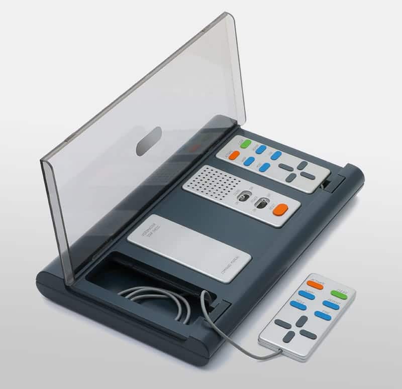
Videomaster did some nice work in the 70s. Their Pong console is rather elegant as is their Star Chess console (yes - I have them).

 Holding the wrong end of the stick since 2009.
 -
That bottom one is so Bang and Olufsen, yet more lovely"I spent years thinking Yorke was legit Downs-ish disabled and could only achieve lucidity through song" - Mr B
-
It' gets the thumbs up from me. Nice, compact and it came with six button dpad as standard (I think)
On modern consoles I really like the white xbone s design. It really looks lovely, don't think it blends too much.SFV - reddave360 -
At the time I thought it looked a bit too Fischer Price. Megadrive and megacd combo looked much more badass in the first form
Though JVC wondermega (?) was a lovely thing, aged better that the Panny Q but still looks better in low light"I spent years thinking Yorke was legit Downs-ish disabled and could only achieve lucidity through song" - Mr B


Howdy, Stranger!
It looks like you're new here. If you want to get involved, click one of these buttons!
Categories
- All Discussions2,715
- Games1,879
- Off topic836